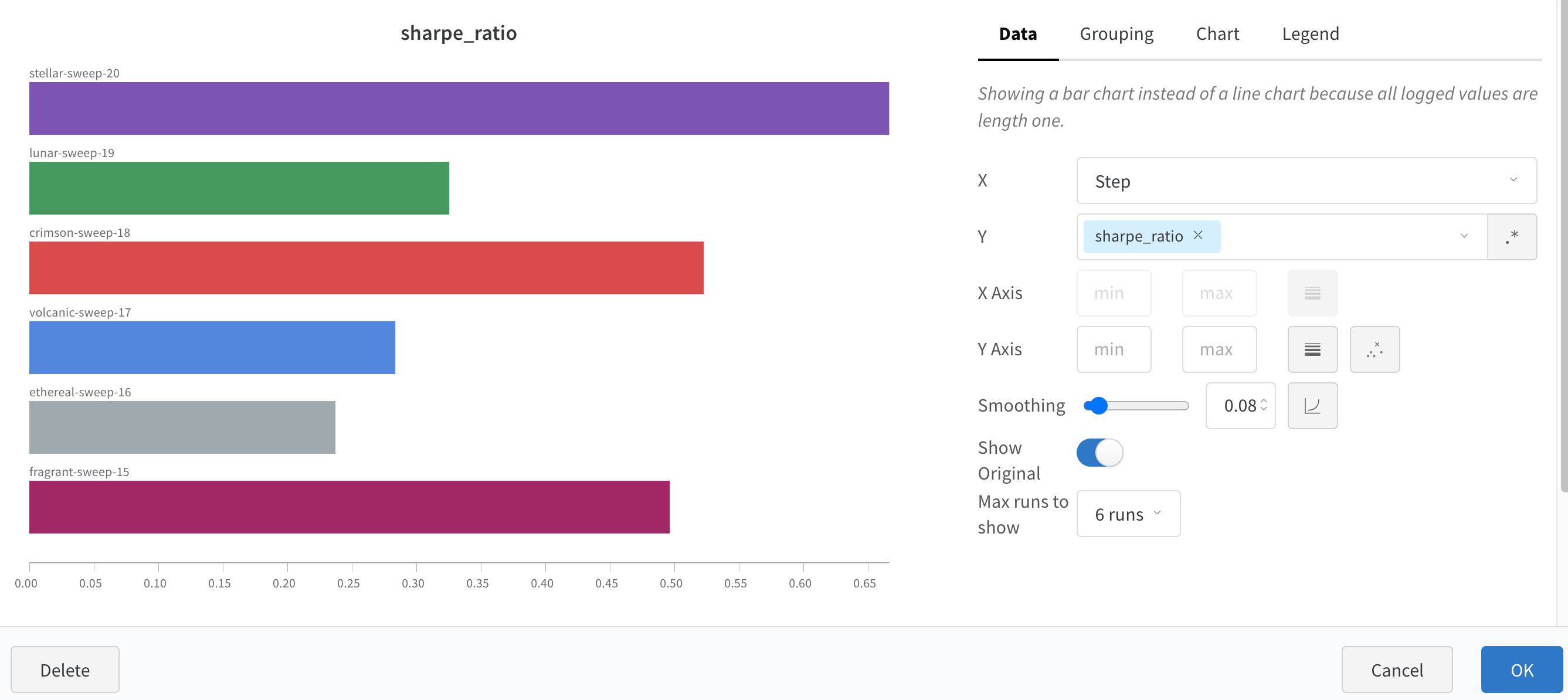
A bar plot presents categorical data with rectangular bars that you can plot vertically or horizontally. Use bar plots to visualize metrics, compare categorical data, and customize axes for your runs. Bar plots appear by default with wandb.Run.log() when all logged values are of length one.
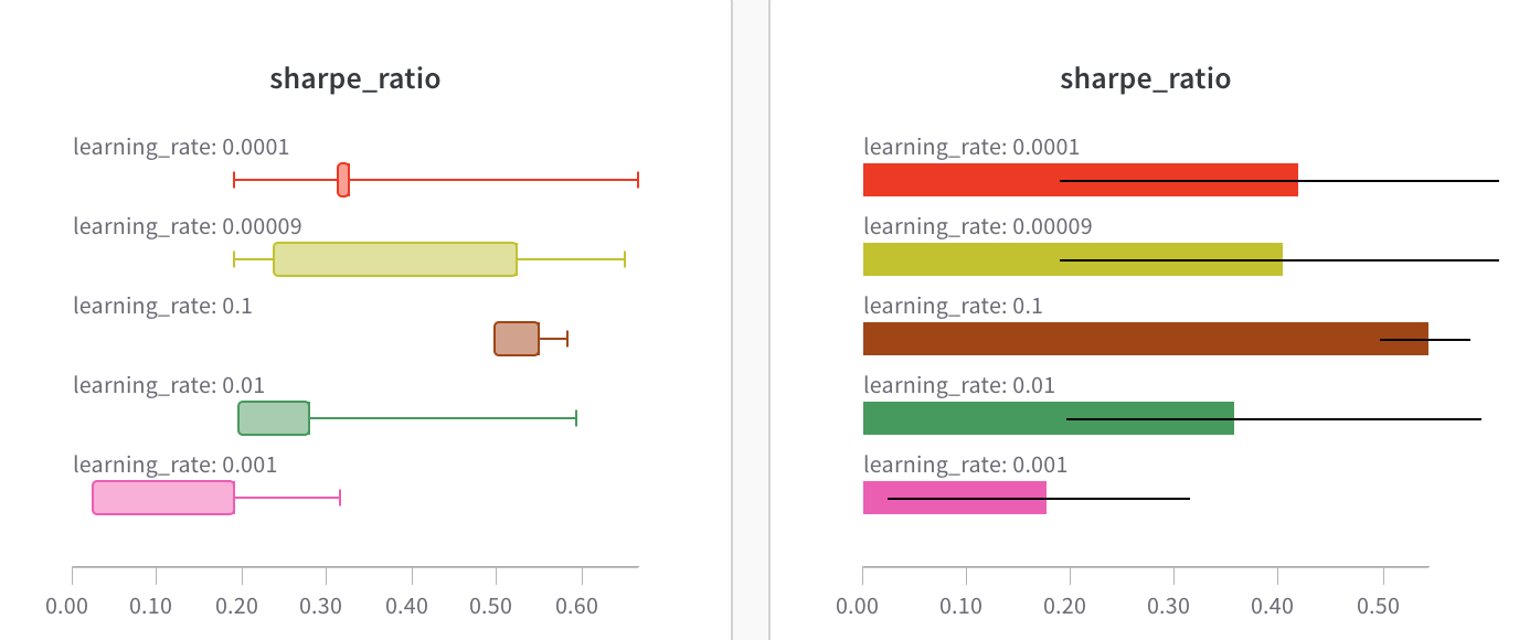
Box and horizontal bar plots in W&B
Use chart settings to limit the maximum number of runs shown, group runs by any config, and rename labels.
Customized bar plot

Customize bar plots

You can also create Box Plot or Violin plots to combine many summary statistics into one chart type, if you group your runs. To create a box or violin plot:
  1. Group your runs in the runs table, or enable grouping in the panel.
  2. In the workspace, click Add panel, then choose Bar Chart.
  3. On the Data tab, use the Metric selector to choose your summary metric.
  4. On the Grouping tab, in the Style control, choose Box Plot or Violin.
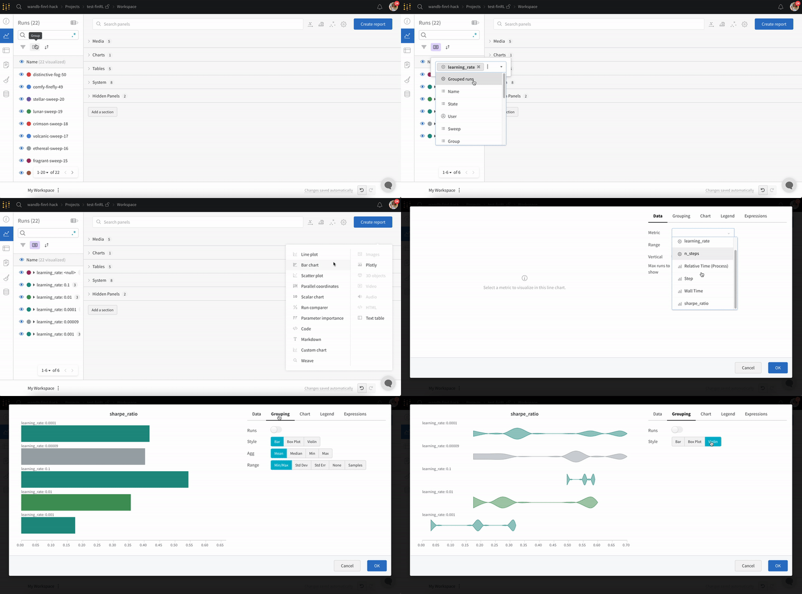
If you do not see the Style control or the Box Plot and Violin options, your runs are not grouped. Group your runs and the options appear.
Customizing a bar plot with grouping options