> ## Documentation Index
> Fetch the complete documentation index at: https://wb-21fd5541-docs-2626.mintlify.site/llms.txt
> Use this file to discover all available pages before exploring further.
# Scikit-Learn
> Use W&B to visualize and compare scikit-learn model performance with experiment tracking and automated plot logging.
This page shows you how to use W\&B to track experiments and automatically log charts that visualize and compare model performance. You can use the W\&B Python SDK (`wandb`) to visualize and compare your scikit-learn models' performance with a few lines of code. [Try an example](https://wandb.me/scikit-colab).
## Get started
### Sign up and create an API key
An API key authenticates your machine to W\&B. You can generate an API key from your user profile.
For a more streamlined approach, go to [User Settings](https://wandb.ai/settings) and create an API key. Copy the API key immediately and save it in a secure location such as a password manager.
1. Click your user profile icon in the upper right corner.
2. Select **User Settings**, then scroll to the **API Keys** section.
### Install the `wandb` library and log in
To install the `wandb` library locally and log in:
1. Set the `WANDB_API_KEY` [environment variable](/models/track/environment-variables/) to your API key. Replace values enclosed in `<>` with your own:
```bash theme={null}
export WANDB_API_KEY=
```
2. Install the `wandb` library and log in.
```shell theme={null}
pip install wandb
wandb login
```
```bash theme={null}
pip install wandb
```
```python theme={null}
import wandb
wandb.login()
```
```notebook theme={null}
!pip install wandb
import wandb
wandb.login()
```
### Log metrics
After installing and logging in, log metrics from your scikit-learn training code so you can compare runs in W\&B.
```python theme={null}
import wandb
with wandb.init(project="visualize-sklearn") as run:
y_pred = clf.predict(X_test)
accuracy = sklearn.metrics.accuracy_score(y_true, y_pred)
# If logging metrics over time, then use run.log
run.log({"accuracy": accuracy})
# OR to log a final metric at the end of training you can also use run.summary
run.summary["accuracy"] = accuracy
```
### Make plots
In addition to logging metrics, you can generate diagnostic plots for your scikit-learn models and log them as part of a run. The following steps initialize a run and then visualize either individual plots or a full set of plots for a given model type.
#### Import wandb and initialize a new run
```python theme={null}
import wandb
run = wandb.init(project="visualize-sklearn")
```
#### Visualize plots
The following sections describe how to visualize individual plots or all plots for a given model type.
##### Individual plots
After training a model and making predictions, you can generate plots in W\&B to analyze your predictions. For more information about supported charts, see the **Supported plots** section.
```python theme={null}
# Visualize single plot
wandb.sklearn.plot_confusion_matrix(y_true, y_pred, labels)
```
##### All plots
W\&B has functions such as `plot_classifier` that plot several relevant plots:
```python theme={null}
# Visualize all classifier plots
wandb.sklearn.plot_classifier(
clf,
X_train,
X_test,
y_train,
y_test,
y_pred,
y_probas,
labels,
model_name="SVC",
feature_names=None,
)
# All regression plots
wandb.sklearn.plot_regressor(reg, X_train, X_test, y_train, y_test, model_name="Ridge")
# All clustering plots
wandb.sklearn.plot_clusterer(
kmeans, X_train, cluster_labels, labels=None, model_name="KMeans"
)
run.finish()
```
#### Existing Matplotlib plots
If you already create plots with Matplotlib, you can log them on the W\&B dashboard alongside your scikit-learn plots. To do that, you must first install `plotly`.
```bash theme={null}
pip install plotly
```
Finally, log the plots on the W\&B dashboard as follows:
```python theme={null}
import matplotlib.pyplot as plt
import wandb
with wandb.init(project="visualize-sklearn") as run:
# do all the plt.plot(), plt.scatter(), etc. here.
# ...
# instead of doing plt.show() do:
run.log({"plot": plt})
```
## Supported plots
The following sections describe each plot type that `wandb.sklearn` can produce, along with the function signature and arguments. Use these as a reference when calling individual plot functions or interpreting the output of `plot_classifier`, `plot_regressor`, and `plot_clusterer`.
### Learning curve
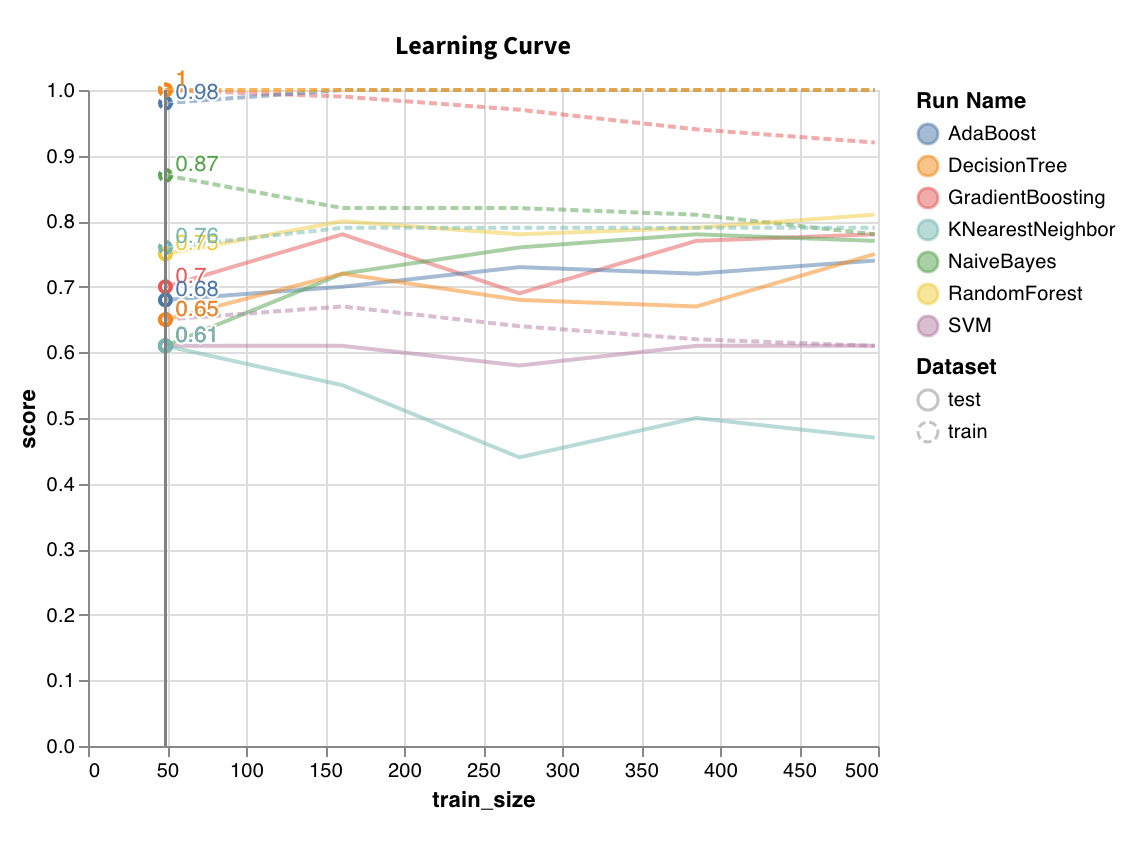 Trains model on datasets of varying lengths and generates a plot of cross-validated scores versus dataset size, for both training and test sets.
`wandb.sklearn.plot_learning_curve(model, X, y)`
* model (clf or reg): Takes in a fitted regressor or classifier.
* X (arr): Dataset features.
* y (arr): Dataset labels.
### ROC
Trains model on datasets of varying lengths and generates a plot of cross-validated scores versus dataset size, for both training and test sets.
`wandb.sklearn.plot_learning_curve(model, X, y)`
* model (clf or reg): Takes in a fitted regressor or classifier.
* X (arr): Dataset features.
* y (arr): Dataset labels.
### ROC
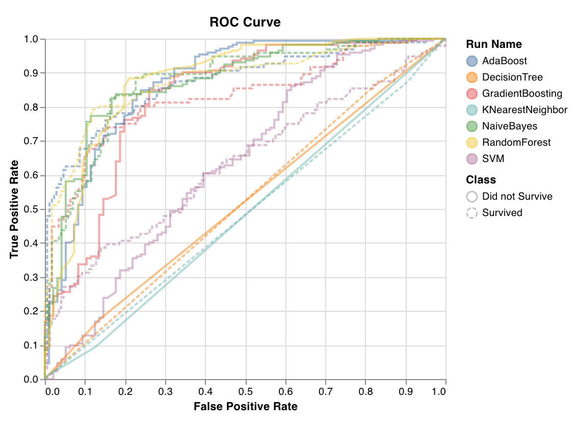 ROC curves plot true positive rate (y-axis) versus false positive rate (x-axis). The ideal score is a TPR = 1 and FPR = 0, which is the point on the top left. You calculate the area under the ROC curve (AUC-ROC), and the greater the AUC-ROC the better.
`wandb.sklearn.plot_roc(y_true, y_probas, labels)`
* y\_true (arr): Test set labels.
* y\_probas (arr): Test set predicted probabilities.
* labels (list): Named labels for target variable (y).
### Class proportions
ROC curves plot true positive rate (y-axis) versus false positive rate (x-axis). The ideal score is a TPR = 1 and FPR = 0, which is the point on the top left. You calculate the area under the ROC curve (AUC-ROC), and the greater the AUC-ROC the better.
`wandb.sklearn.plot_roc(y_true, y_probas, labels)`
* y\_true (arr): Test set labels.
* y\_probas (arr): Test set predicted probabilities.
* labels (list): Named labels for target variable (y).
### Class proportions
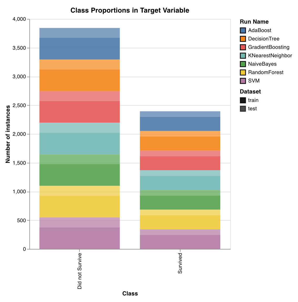 Plots the distribution of target classes in training and test sets. Useful for detecting imbalanced classes and ensuring that one class doesn't have a disproportionate influence on the model.
`wandb.sklearn.plot_class_proportions(y_train, y_test, ['dog', 'cat', 'owl'])`
* y\_train (arr): Training set labels.
* y\_test (arr): Test set labels.
* labels (list): Named labels for target variable (y).
### Precision recall curve
Plots the distribution of target classes in training and test sets. Useful for detecting imbalanced classes and ensuring that one class doesn't have a disproportionate influence on the model.
`wandb.sklearn.plot_class_proportions(y_train, y_test, ['dog', 'cat', 'owl'])`
* y\_train (arr): Training set labels.
* y\_test (arr): Test set labels.
* labels (list): Named labels for target variable (y).
### Precision recall curve
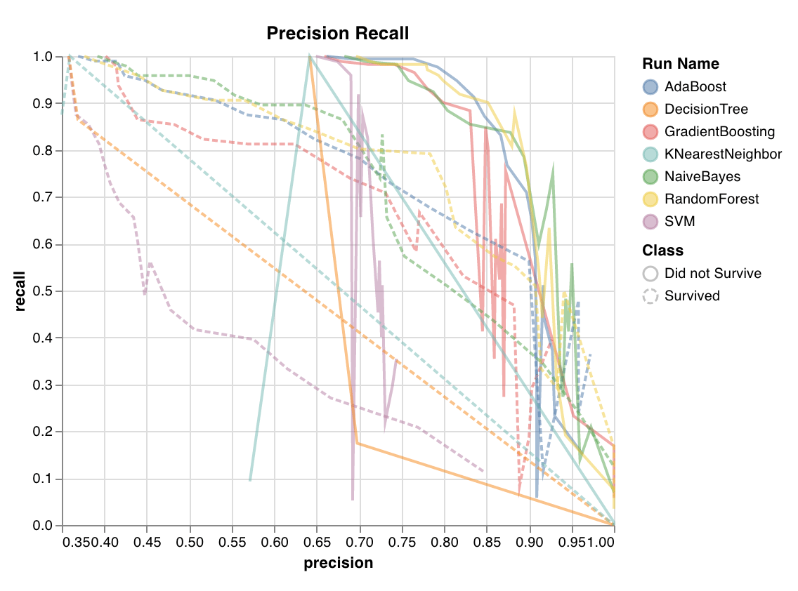 Computes the tradeoff between precision and recall for different thresholds. A high area under the curve represents both high recall and high precision, where high precision relates to a low false positive rate, and high recall relates to a low false negative rate.
High scores for both show that the classifier is returning accurate results (high precision), as well as returning a majority of all positive results (high recall). The precision-recall curve is useful when the classes are imbalanced.
`wandb.sklearn.plot_precision_recall(y_true, y_probas, labels)`
* y\_true (arr): Test set labels.
* y\_probas (arr): Test set predicted probabilities.
* labels (list): Named labels for target variable (y).
### Feature importances
Computes the tradeoff between precision and recall for different thresholds. A high area under the curve represents both high recall and high precision, where high precision relates to a low false positive rate, and high recall relates to a low false negative rate.
High scores for both show that the classifier is returning accurate results (high precision), as well as returning a majority of all positive results (high recall). The precision-recall curve is useful when the classes are imbalanced.
`wandb.sklearn.plot_precision_recall(y_true, y_probas, labels)`
* y\_true (arr): Test set labels.
* y\_probas (arr): Test set predicted probabilities.
* labels (list): Named labels for target variable (y).
### Feature importances
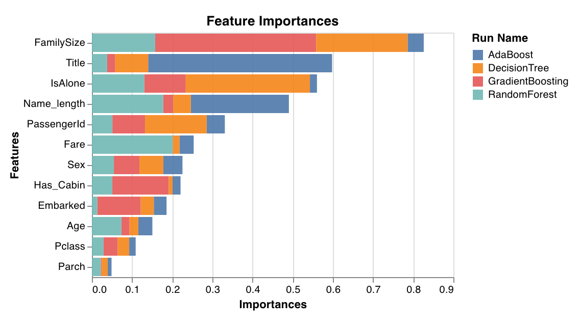 Evaluates and plots the importance of each feature for the classification task. Only works with classifiers that have a `feature_importances_` attribute, such as trees.
`wandb.sklearn.plot_feature_importances(model, ['width', 'height', 'length'])`
* model (clf): Takes in a fitted classifier.
* feature\_names (list): Names for features. Makes plots easier to read by replacing feature indexes with corresponding names.
### Calibration curve
Evaluates and plots the importance of each feature for the classification task. Only works with classifiers that have a `feature_importances_` attribute, such as trees.
`wandb.sklearn.plot_feature_importances(model, ['width', 'height', 'length'])`
* model (clf): Takes in a fitted classifier.
* feature\_names (list): Names for features. Makes plots easier to read by replacing feature indexes with corresponding names.
### Calibration curve
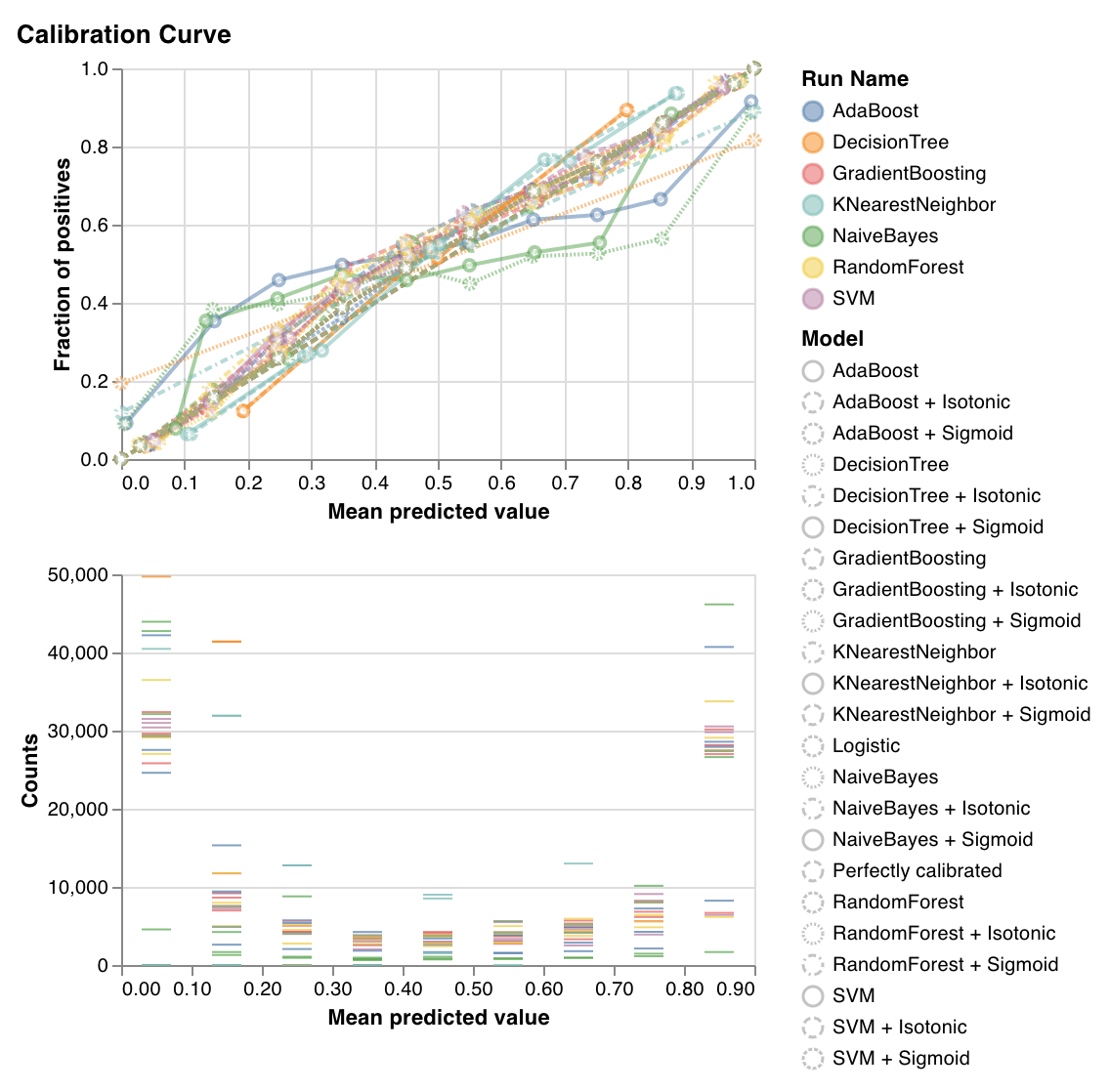 Plots how well calibrated the predicted probabilities of a classifier are and how to calibrate an uncalibrated classifier. Compares estimated predicted probabilities by a baseline logistic regression model, the model passed as an argument, and by both its isotonic calibration and sigmoid calibrations.
The closer the calibration curves are to a diagonal the better. A transposed sigmoid-like curve represents an overfitted classifier, while a sigmoid-like curve represents an underfitted classifier. By training isotonic and sigmoid calibrations of the model and comparing their curves, you can figure out whether the model is over or underfitting and, if so, which calibration (sigmoid or isotonic) might help fix this.
For more details, check out [sklearn's docs](https://scikit-learn.org/stable/auto_examples/calibration/plot_calibration_curve.html).
`wandb.sklearn.plot_calibration_curve(clf, X, y, 'RandomForestClassifier')`
* model (clf): Takes in a fitted classifier.
* X (arr): Training set features.
* y (arr): Training set labels.
* model\_name (str): Model name. Defaults to `"Classifier"`.
### Confusion matrix
Plots how well calibrated the predicted probabilities of a classifier are and how to calibrate an uncalibrated classifier. Compares estimated predicted probabilities by a baseline logistic regression model, the model passed as an argument, and by both its isotonic calibration and sigmoid calibrations.
The closer the calibration curves are to a diagonal the better. A transposed sigmoid-like curve represents an overfitted classifier, while a sigmoid-like curve represents an underfitted classifier. By training isotonic and sigmoid calibrations of the model and comparing their curves, you can figure out whether the model is over or underfitting and, if so, which calibration (sigmoid or isotonic) might help fix this.
For more details, check out [sklearn's docs](https://scikit-learn.org/stable/auto_examples/calibration/plot_calibration_curve.html).
`wandb.sklearn.plot_calibration_curve(clf, X, y, 'RandomForestClassifier')`
* model (clf): Takes in a fitted classifier.
* X (arr): Training set features.
* y (arr): Training set labels.
* model\_name (str): Model name. Defaults to `"Classifier"`.
### Confusion matrix
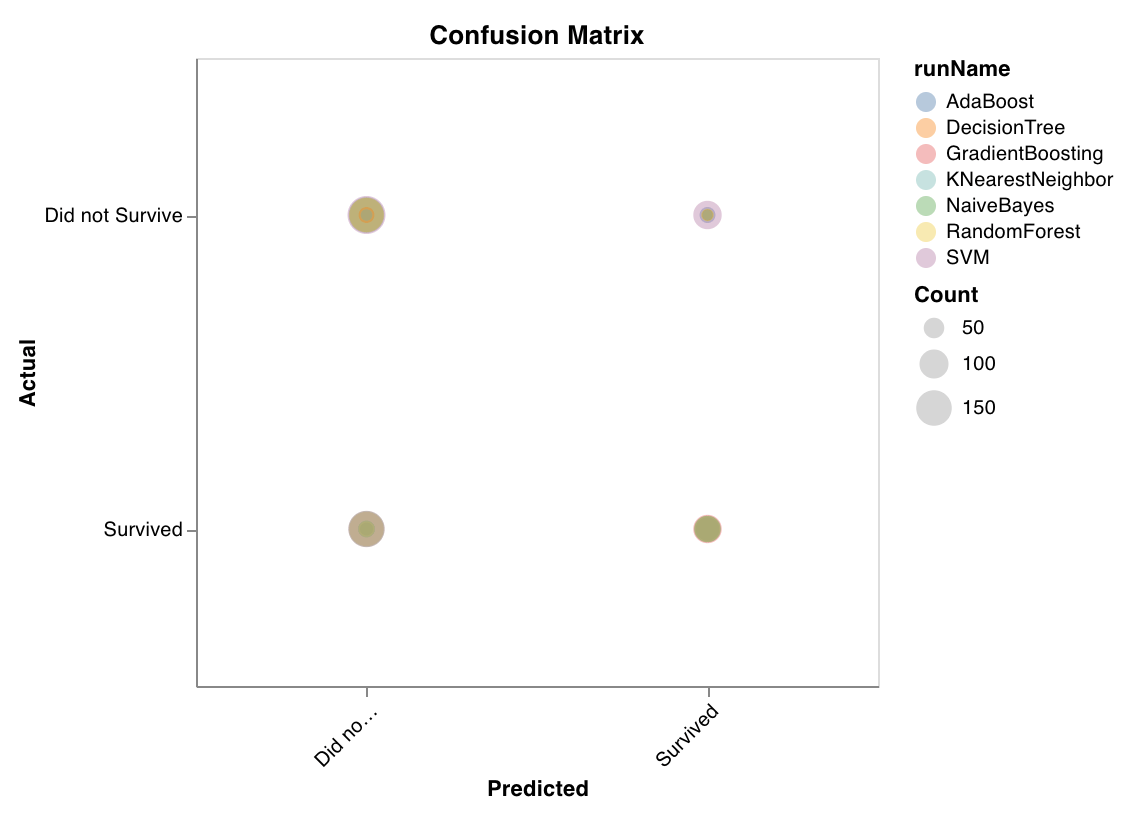 Computes the confusion matrix to evaluate the accuracy of a classification. It's useful for assessing the quality of model predictions and finding patterns in incorrect predictions. The diagonal represents the predictions where the actual label is equal to the predicted label.
`wandb.sklearn.plot_confusion_matrix(y_true, y_pred, labels)`
* y\_true (arr): Test set labels.
* y\_pred (arr): Test set predicted labels.
* labels (list): Named labels for target variable (y).
### Summary metrics
Computes the confusion matrix to evaluate the accuracy of a classification. It's useful for assessing the quality of model predictions and finding patterns in incorrect predictions. The diagonal represents the predictions where the actual label is equal to the predicted label.
`wandb.sklearn.plot_confusion_matrix(y_true, y_pred, labels)`
* y\_true (arr): Test set labels.
* y\_pred (arr): Test set predicted labels.
* labels (list): Named labels for target variable (y).
### Summary metrics
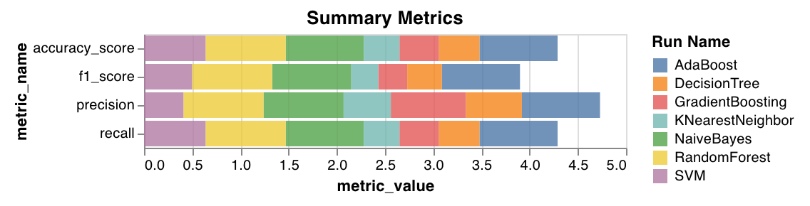 * Calculates summary metrics for classification, such as `mse`, `mae`, and `r2` score.
* Calculates summary metrics for regression, such as `f1`, accuracy, precision, and recall.
`wandb.sklearn.plot_summary_metrics(model, X_train, y_train, X_test, y_test)`
* model (clf or reg): Takes in a fitted regressor or classifier.
* X (arr): Training set features.
* y (arr): Training set labels.
* X\_test (arr): Test set features.
* y\_test (arr): Test set labels.
### Elbow plot
* Calculates summary metrics for classification, such as `mse`, `mae`, and `r2` score.
* Calculates summary metrics for regression, such as `f1`, accuracy, precision, and recall.
`wandb.sklearn.plot_summary_metrics(model, X_train, y_train, X_test, y_test)`
* model (clf or reg): Takes in a fitted regressor or classifier.
* X (arr): Training set features.
* y (arr): Training set labels.
* X\_test (arr): Test set features.
* y\_test (arr): Test set labels.
### Elbow plot
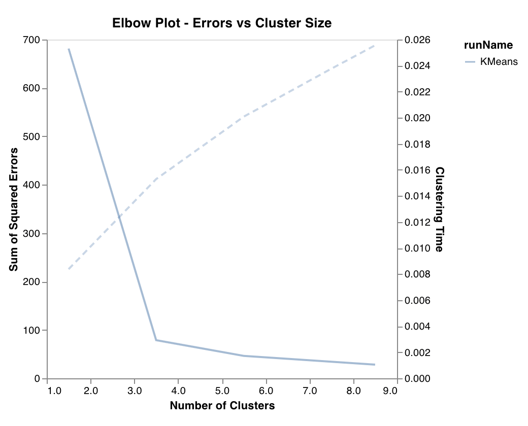 Measures and plots the percentage of variance explained as a function of the number of clusters, along with training times. Useful in picking the optimal number of clusters.
`wandb.sklearn.plot_elbow_curve(model, X_train)`
* model (clusterer): Takes in a fitted clusterer.
* X (arr): Training set features.
### Silhouette plot
Measures and plots the percentage of variance explained as a function of the number of clusters, along with training times. Useful in picking the optimal number of clusters.
`wandb.sklearn.plot_elbow_curve(model, X_train)`
* model (clusterer): Takes in a fitted clusterer.
* X (arr): Training set features.
### Silhouette plot
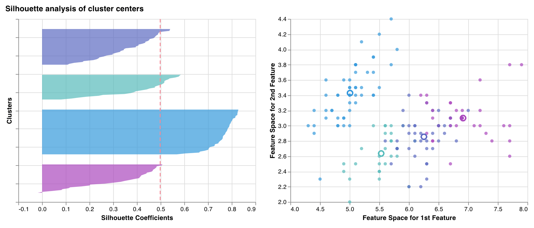 Measures and plots how close each point in one cluster is to points in the neighboring clusters. The thickness of the clusters corresponds to the cluster size. The vertical line represents the average silhouette score of all the points.
Silhouette coefficients near +1 indicate that the sample is far away from the neighboring clusters. A value of 0 indicates that the sample is on or close to the decision boundary between two neighboring clusters, and negative values indicate that those samples might have been assigned to the wrong cluster.
You want all silhouette cluster scores to be above average (past the red line) and as close to 1 as possible. You also prefer cluster sizes that reflect the underlying patterns in the data.
`wandb.sklearn.plot_silhouette(model, X_train, ['spam', 'not spam'])`
* model (clusterer): Takes in a fitted clusterer.
* X (arr): Training set features.
* cluster\_labels (list): Names for cluster labels. Makes plots easier to read by replacing cluster indexes with corresponding names.
### Outlier candidates plot
Measures and plots how close each point in one cluster is to points in the neighboring clusters. The thickness of the clusters corresponds to the cluster size. The vertical line represents the average silhouette score of all the points.
Silhouette coefficients near +1 indicate that the sample is far away from the neighboring clusters. A value of 0 indicates that the sample is on or close to the decision boundary between two neighboring clusters, and negative values indicate that those samples might have been assigned to the wrong cluster.
You want all silhouette cluster scores to be above average (past the red line) and as close to 1 as possible. You also prefer cluster sizes that reflect the underlying patterns in the data.
`wandb.sklearn.plot_silhouette(model, X_train, ['spam', 'not spam'])`
* model (clusterer): Takes in a fitted clusterer.
* X (arr): Training set features.
* cluster\_labels (list): Names for cluster labels. Makes plots easier to read by replacing cluster indexes with corresponding names.
### Outlier candidates plot
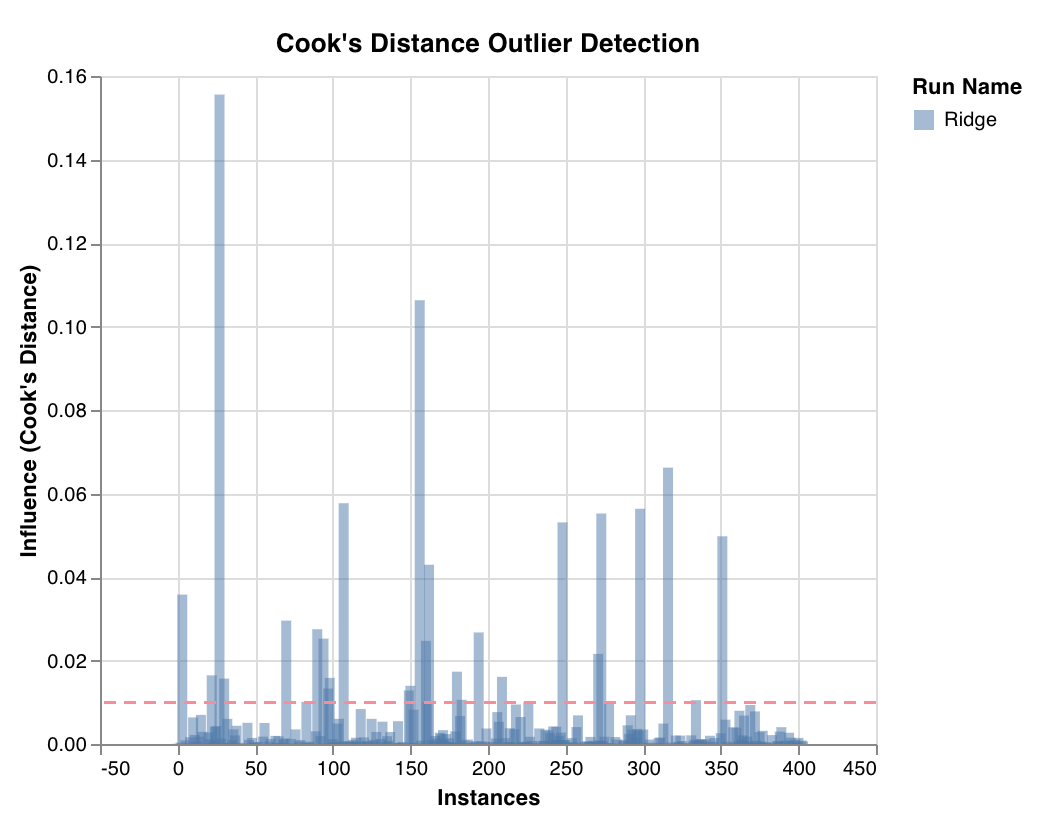 Measures a datapoint's influence on regression model through Cook's distance. Instances with heavily skewed influences could be outliers. Useful for outlier detection.
`wandb.sklearn.plot_outlier_candidates(model, X, y)`
* model (regressor): Takes in a fitted classifier.
* X (arr): Training set features.
* y (arr): Training set labels.
### Residuals plot
Measures a datapoint's influence on regression model through Cook's distance. Instances with heavily skewed influences could be outliers. Useful for outlier detection.
`wandb.sklearn.plot_outlier_candidates(model, X, y)`
* model (regressor): Takes in a fitted classifier.
* X (arr): Training set features.
* y (arr): Training set labels.
### Residuals plot
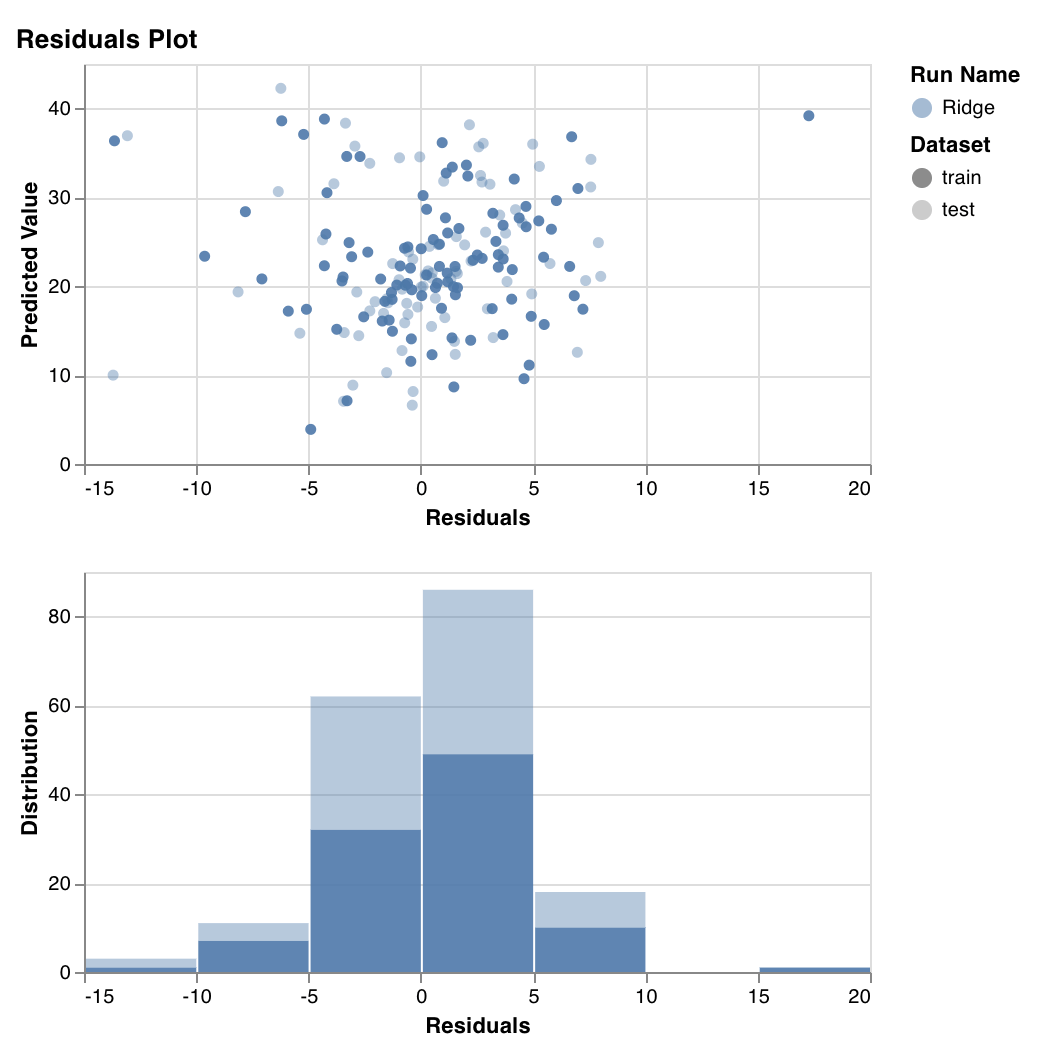 Measures and plots the predicted target values (y-axis) versus the difference between actual and predicted target values (x-axis), as well as the distribution of the residual error.
The residuals of a well-fit model should be randomly distributed because good models account for most phenomena in a data set, except for random error.
`wandb.sklearn.plot_residuals(model, X, y)`
* model (regressor): Takes in a fitted classifier.
* X (arr): Training set features.
* y (arr): Training set labels.
If you have any questions, ask them in the [Slack community](https://wandb.me/slack).
## Example
[Run in colab](https://wandb.me/scikit-colab): A simple notebook to get you started.
Measures and plots the predicted target values (y-axis) versus the difference between actual and predicted target values (x-axis), as well as the distribution of the residual error.
The residuals of a well-fit model should be randomly distributed because good models account for most phenomena in a data set, except for random error.
`wandb.sklearn.plot_residuals(model, X, y)`
* model (regressor): Takes in a fitted classifier.
* X (arr): Training set features.
* y (arr): Training set labels.
If you have any questions, ask them in the [Slack community](https://wandb.me/slack).
## Example
[Run in colab](https://wandb.me/scikit-colab): A simple notebook to get you started.